3 Signs your digital services aren’t working for your customers
Doubts About Your Digital Services? Ask yourself these 3 questions
Shifting your city services from in-person to online is a giant leap down the road of customer experience and transformation. In doing so, you’ve given residents the convenience of paying, applying, requesting or connecting from the comfort of their own personal devices.
Convenience is great, but what about confidence? Your services may be digital, but are they doing the job?
- Are customers complaining that your website is difficult to use?
- Are your front-line support officers spending too much time talking people through online forms?
- Are customer call-backs often required to confirm incomplete or incorrect form details?
If you answer “yes” to any of the above, it sounds like your online forms need a tune-up. Luckily, there are a few clear, quick online form fixes you can make to see measurable improvements in these areas.
Reduce website complaints
Most people come to your website to get things done. Make it easy for them! Website analytics allow you to regularly review and re-prioritise homepage tasks and services based on historic data and peak service indicators. For example, in winter, take steps to prioritise snow removal, water main break reporting, and other relevant services on your homepage, making them easy to find.
You can also prioritise services based on visitor context when you know the type of device in use. For example, a visitor using a desktop device is likely to engage in information-heavy tasks like zoning permits. On the flip side, mobile device users tend to be focused on location-centric tasks. Analytics allow you to personalise and simplify each person’s service interaction.
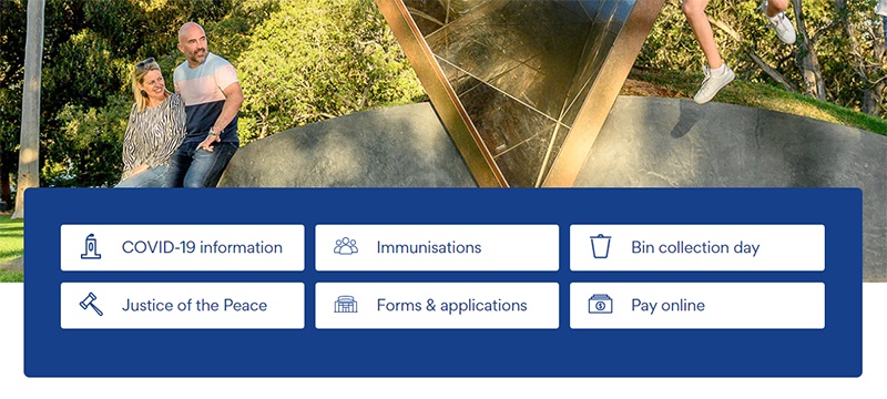
City of Unley regularly updates top homepage tasks to reflect historical seasonal trends, alongside current trends. For instance, as winter approaches, immunisation programmes take priority, alongside COVID related services.

Reduce need for assistance.
People want to self-service. It feels good to get things done, and if they can avoid it, they would prefer not to call you for help. But calling is inevitable when people come up against a form that’s confusing or overwhelming.
Eliminate confusion by using simple, clear and instructional language on the form. Break up long forms into a concise flow of bite-sized sections, allowing people to complete a request in digestible steps. One powerful capability is smart logic, so you can hide irrelevant form questions and sections based on the customer’s previous answers.
Reduce customer call-backs.
Governments lose more productivity every year to incorrectly completed forms or incorrectly directed requests. They create a domino effect of frustration, delays and rework for residents and staff alike.
You can break this chain of inefficiency by connecting forms to internal systems in order to run real-time validation and autofill options to help residents ensure correct data entry.
Moreton Bay Regional Council automatically validates location-based requests by connecting form fields to the customer address information stored in their internal systems. This ensures the requestor is in fact a resident of the municipality and eligible for the service being requested, such as waste collection.
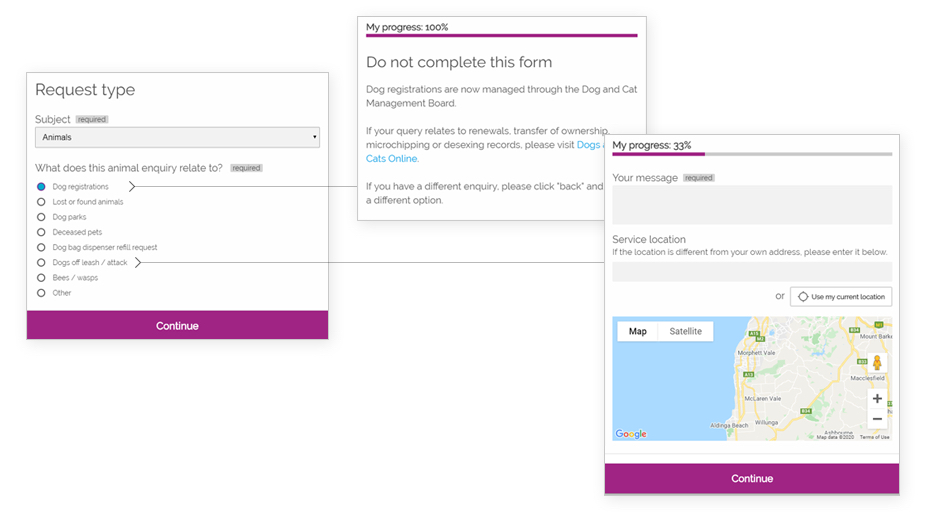
Put conditions in place to disable the form submit button if a customer is ineligible for the service, and instead present them with an explanation screen and proper next steps. This saves time and pain on both sides of the submission process, and goes a long way in building user confidence in your digital services.

“Customers were regularly directing their animal registration requests to the City, not realising this was actually a state government service. By adding animal registrations to our customer request form, we can easily redirect customers to the right entity before they waste time filling out a request. This also saves our teams time handling misdirected requests.”
Kym Harvey, City of Onkaparinga